Andrew Lamprecht met up with South African artist Gavin Rain at Worldart in Cape Town to discuss his creative process, neuropsychology, his Masters in Space Studies and his participation in the 54th Venice Biennale. Rain is best known for his op-art pointillist paintings that combine mathematics, precision and a love for analogue photography. Practicing as a painter throughout his career, he developed his specific pointillist style from 2003. Since then he has built up an impressive collection of pointillist portraits, cityscapes and other interesting subject matter.
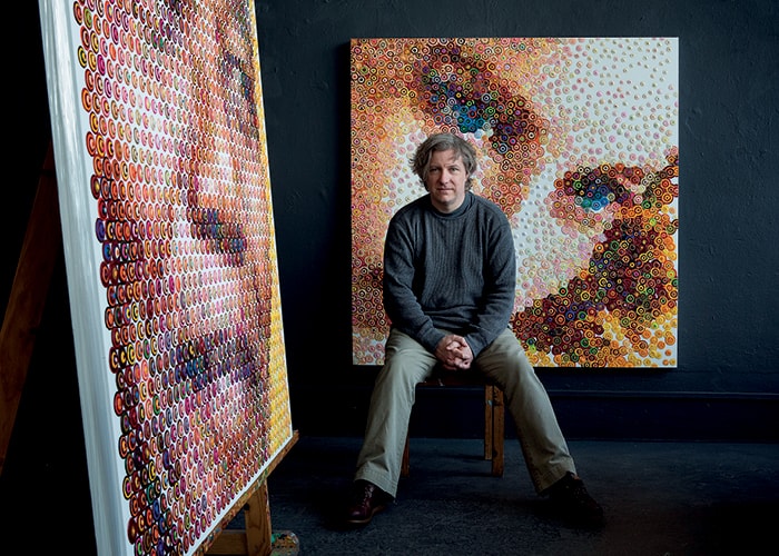 Gavin Rain in his studio. October 2015. Photograph: Dale Yudelman.
Andrew Lamprecht: I want to start by telling you a story that happened not very long ago. I was giving an opening speech for a design and art show at Eclectica Design and Art gallery (in Cape Town). As I was taking photographs of the interior and your work at the back, something very strange happened. When I looked at your paintings through the lens of the cellphone they dissolved and looked totally different. Everything else looked the same, but suddenly your paintings look quite different. It was like a neuropsychological phenomenon or an optical illusion.
Gavin Rain: Did you know that I studied neuropsychology? I began this process by trying to come up with a different style of art – like everyone does. It took about two years to come up with this style of painting, this way of expressing myself. I knew that I wanted to say something with the art and to impart a message. I’m tired of going into galleries
and not being able to understand the art. I blame the artist, because I think that one’s message should come across easily. As an artist I feel the necessity for a person to ‘get it.’ I think it’s quite a tragedy to not ‘get’ Klein or Rothko. On the surface Rothko is perhaps quite difficult to understand, but if you don’t then you miss how elegant and beautiful his work really is.
On one level, yes. But on another level, I only ‘got’ your work when I looked at it through a camera lens.
I never thought of a camera lens. What I planned was the message behind the art. The idea – that people should step back and think about things in themselves – was formulated before the art. I wanted the art to be the vehicle that makes you physically step back in order to experience the painting. Up close, there is this overwhelming mass of dots, which is hard to interpret besides for a few little patterns. It’s hard to see anything else. In this way my paintings are like our lives, where in order to make sense of it, we need to step back to see the big picture. It’s made up of everything that informs life; people, ideas, and so on. My subject matter is the things that make people who they are.
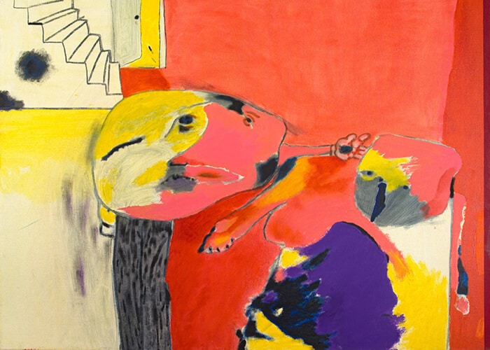
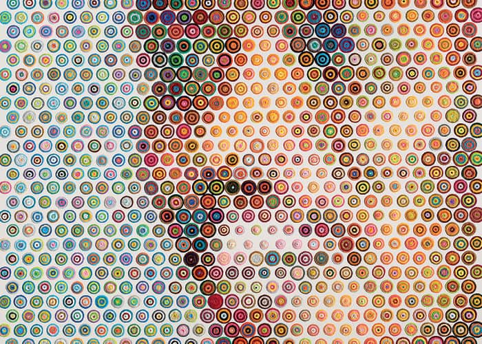 Gavin Rain, detail of New Biko, 2014. Acrylic on canvas, 150 x 150cm. All images courtesy of WorldArt, Cape Town.
So are the individual dots laden with symbolism and meaning?
Yes. At an individual dot level I play around or I will pick contrasting or complementary colours – here I have a bit of dialogue or artistic license. But at a group level, the dots create an immersion of colour and pattern where there’s a form, but its hidden in plain sight. The beauty of this is that you know you’re looking at something, but you can’t get a sense of what it is until you remove yourself.
What about the colours you used to create the flag of the world cup?
That’s where my colour painting started. Initially I used to paint only in varying colours of the same hue. I moved to multiple colours for that FIFA project. I don’t know all that much about soccer and I decided to try it as an experiment. The process involved taking every flag of the world and creating a set of five colours. Initially I had created all the maths for five rings, and then I came to South Africa (which is the only country with more than five colours in its flag) and I realised that I had made a mistake.
Let’s chat about the maths – your working method is fascinating. I’ve read that the preparation time can take up to eleven months before any paint is put on canvas. What procedure do you follow to create this incredible effect?
There are two mathematical procedures that are done independently of each other and then combined. The first is a bit like a halftone cut and creation where I take a photograph, divide it into a grid and then photograph each section of that grid with my camera on blur. I blur the grid image to get a single grayscale colour or tone in all of the blocks. I have a set of ten to fifteen cards ranging from white to black and I then pick the one closest in colour. This gives me the size of the circle and creates a halftone. The proportion of black on a white background then either hides all the white or shows the black through the white background. This makes the general form of the painting.
It’s more complicated to get the same result with colours. I repeat the process to get a blur, but in this case the colour will be closer to a peach tone. I created a library of 12462 dots by photographing and blurring them individually. Then with the resulting colours, I created an index of blurs. It’s almost like this reverse index phonebook of blurs. So when I need a specific colour, I go into my index and look at the different versions to choose the closest one.
Because the optical effect of your work is so overwhelming, it’s easy to miss how this process is metaphorical of human relationships between people close and far. Does the texture have anything to do with this?
The texture is important as it shows another side to my thinking. The texture is perhaps the reason that I came up with this style; it puts the focus back into the painting – the tangible, creation-based aspect of my work. I think that we’ve lost a lot of this due to the advent of digital photography and the digitisation of images. This is significant to me as photography has always been a big part of my life. Growing up, I learnt photography from my grandfather who was a professional portrait and landscape photographer. I used to carry his camera bags and sit with him in the darkroom.
This was where I fell in love with the magic of analogue photography because the beauty of it is found in the process and the art of the labour. That all changed with the new kid on the block; digital photography. At the time, I really disliked digital photography, the quality of the imagery was dreadful but it was so convenient! That’s the drudgery of our society today and it’s such an analogy for who we are. If it’s easier, we do it. Digital actually means ‘distinct interval’ or lack of flow. Film photography allows a beautiful, limitless gradient of tone and colour that you just can’t get with digital.
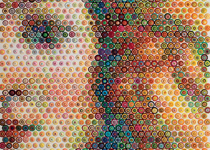 Gavin Rain, detail of Venus, 2014. Acrylic on canvas, 120 x 120cm.
I believe that digital photography is something quite distinct from photography. On a visual level it looks the same, but it’s actually a completely different thing.
Yes, digital imaging is very different – and there is a vast divide between the two approaches. I’m currently studying a Masters in Space Science and one of the modules is about space application, studying satellite imagery and how it works. We look at things like hyper-spectral or multi-spectral images that allow you to see the most amazing things. But its important to know that that’s imaging, not photography – even though they both create an image. Using data to create something visual doesn’t make it a photograph and I think that should be the division.
And how does that relate back to your painting style?
I wanted to take something ostensibly digital and put it back into the analogue realm. In terms of style, this is achieved by pointing out that the gaps between the dots are a dead area. It works in the same way thatbetween M.C Escher and Vasarely. They were my two greatest artists. I loved the precision and the mathematics that created the dimensionality in their work. Last year I actually got to do an exhibition in Venice alongside some of Vasarely’s work.
I wanted to ask you about the subject matter. You work primarily in portraiture, although I know that you’ve done cityscapes, and boobs. What is the link between the subject matter and the technique and the form?
There often is a link. I like to paint popular icons like Audrey Hepburn and Marilyn Monroe. Marilyn Monroe has been dead for fifty-odd years and yet she’s still probably zooming in on a digital photograph would, as the image starts to pixelate. So, this dead area is really just sacrificing quality for the sake of convenience. In order to return to that quality and craftsmanship, I use paint to texture the digital imagery, which I see as inherently dead, flat and lifeless. However, over time I have found digital images massively useful, so my perception has changed.
You seem to have a general frustration with art. Are there any painters with whom you don’t experience this?
I admire artists who can translate their message. I adore artists like Rothko and the Russian Expressionists such as Kandinsky and Stepanova. I enjoy the chutzpah they have and I like their attitudes. Often, art movements are named only after the artists are dead, but the Expressionists went up and made their own movement. They said, “This is what we stand for, this is what we’re going to do and this is why we are going to do it.”
Speaking of the Expressionists and the chutzpah in naming their own work, when referring to your work, the terms ‘pointillism’ as well as ‘neo-pixelism’ have been used.
I guess if I were asked, I would call myself a pointillist or neo-pointillist, although many people call me an op-artist like Victor Vasarely. When I was younger, I alternated one of the most well known pop icons out there. They are still drivers in our society. I find myself fascinated by the individuals who become nodal in our society. They’re at the centre of relative clusters that make up our society and I want to know why.
So then, are you driven by celebrity or identifiability?
I think its identifiability, but usually the two become equal. I also enjoy political figures.
Tell us more about Aung San Suu Kyi, the political figure who is a great inspiration to you.
I painted her for the 54th Venice Biennale. I thought it would be this huge political statement, but no one gave a fuck. It was in the back area of the biennale so maybe it just wasn’t that visible. But, I’ve been in touch with her foundation and we are trying to get one of the works into the London Portrait Gallery. We created a work for each year that she was under house arrest. I made eleven identical works in an attempt to reverse engineer a pop icon. I want to put her face out there so that it becomes well known, because the worst thing about her is that nobody knows who she is, despite her being such an important force in the area.
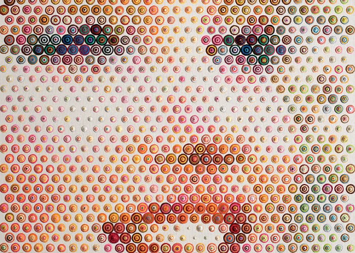 Gavin Rain, detail of Marilyn, 2014. Acrylic on canvas, 120 x 120cm.
And why were you drawn to her particularly?
My partner is a lawyer – she’s interested in human rights law and thus became interested in Kyi. I read about her and she piqued my interest, too. Her life is basically a song of tragedy and I’m amazed by her resilience – it’s something I really admire more than anything else. The obvious reference is Nelson Mandela. I remember being involved in the ANC in varsity. When I think about that I feel fear and horror, I never thought that it was going to end. I just thought that sooner or later they would come get us. I’m amazed by people who endure that feeling for years and years. Aung San Suu Kyi should be an example to the world for that, yet she’s as well known as Steve Biko, which is ridiculous. Another political figure that I painted was an ex-Mayor of a town in Mexico. She was assassinated by the drug cartels because she fought against them. I’ve done some Steve Bikos as well, but I never wanted to do a Nelson Mandela painting. I thought it was completely overdone – then I ended up painting one anyway.
As someone who has many degrees, accomplishments and areas of expertise, you must know a fair deal about resilience. Tell us about your trajectory from Fine Art to a Master’s degree in Space Science?
I never map my routes; I usually just pick the roads in front of me. I started studying Art at Ruth Prowse and then did History of Art, followed by neuropsychology at The University of Cape Town. After I graduated I did an Honours degree in psychology. I was always painting, but I was never content because I felt that I wasn’t saying anything. Finally I got to the point where I had something that I wanted to say and I knew how to say it. Now I’m studying Space Science. I think that art and science are trying to do the same thing – they are trying to take you into an area of the unknown and make you feel comfortable with being there.
The final question; what of the future?
My current style is based on observations around photography, and through these explorations, I have also made observations about our society in general. I’ve been inspired by old publications on traditional photography techniques. In investigating these different kinds of photography, I came across a technique called ‘Autochrome Lumière.’ It is the most beautiful early-Victorian attempt at colour photography. It involves dyeing potato starch beads and then randomly distributing them on the canvas in reds, greens and blues. They become little lenses to filter the light, so your subject has to stay still, but that’s true of Victorian photography anyways. It creates the most amazing grain in the background and it’s also different in that it creates the colour. I’ve been investigating the mathematics around this technique for quite some time and I’m moving towards using a completely random distribution of dots. Well, it’s pseudo-random, because I try to ensure that the dots are more or less equidistant but instead of using the grid, I base the sizing on certain points in the image, which creates a different texture.
Exactly. Your work has taken on a softness, which is different.
Absolutely. The hardness is a result of the fact that the painting came from a digital image. I wanted to move away from that and more into a painterly resolve. I have created these patterns which allow the eye to move in a geometric manner and travel around a lot more. As I said, I’m inspired by Autochrome Lumière; the way it makes the viewer want to engage with the work up close, so that you can see the colours. But the result is almost more painterly and vibrant, so it looks like very little is happening. I also wanted to have a level of engagement with the work from afar, which I found was lacking here.
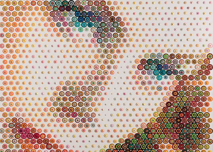 Gavin Rain, detail of Grace, 2015. Acrylic on canvas, 180 x 180cm.
Andrew Lamprecht is a curator and lecturer at the Michaelis School of Fine Art (UCT) in Cape Town, South Africa.