Art South Africa Volume 7: Issue 01
Gabrielle Goliath; Hasan and Husain Essop; Reshma Chhiba; Rowan Smith
WHODUNIT? SHE DID!
GABRIELLE GOLIATH’S RECENT WORK IS AS MUCH ABOUT THE POLITICAL AND HISTORICAL MEANINGS OF THE BODY AS IT IS ABOUT SELF-LOVE AND SELF-LOATHING, WRITES ANTHEA BUYS.
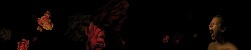
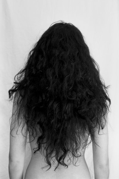
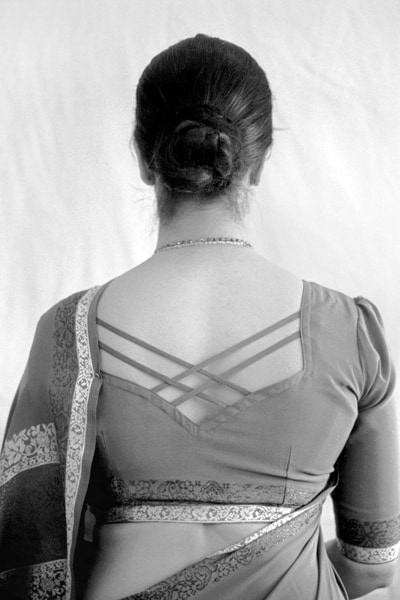
 top – bottom Bouquet III, (left panel), (middle panel), (right panel), 2007, archival print, 130 x 26cm.
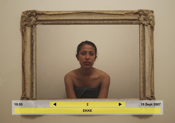
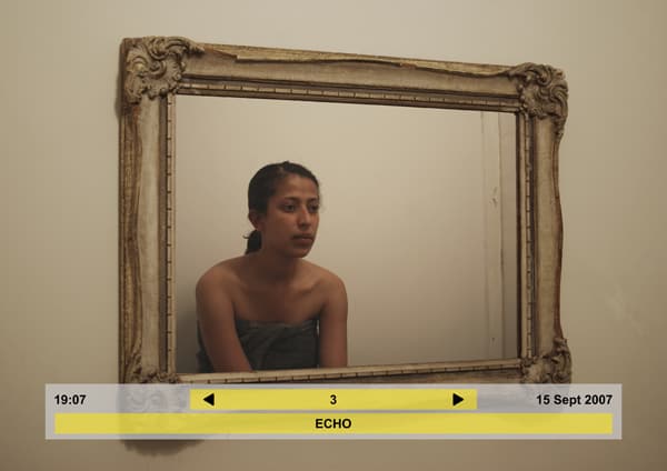
Gabrielle Goliath’s first significant public appearance as an artist was in March 2008, at the opening of a group exhibition Four Tales, hosted by Gallery Momo in Parkhurst, Johannesburg. She was the subject of a photographic and video triptych titled Bouquet (2007), bare-shouldered and adrift in a black pool-like background. Her mouth gaped open and out of it snaked a panoply of floral clusters. She looked shellshocked, brutalised, but unmistakeably herself. The real Gabrielle Goliath, who attended the opening event, went largely unrecognised, a detail difficult to reconcile with the recurring presence of the artist’s self image in her photography-based works.
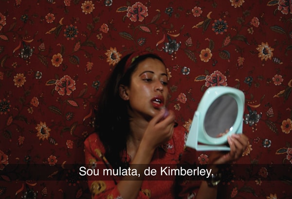
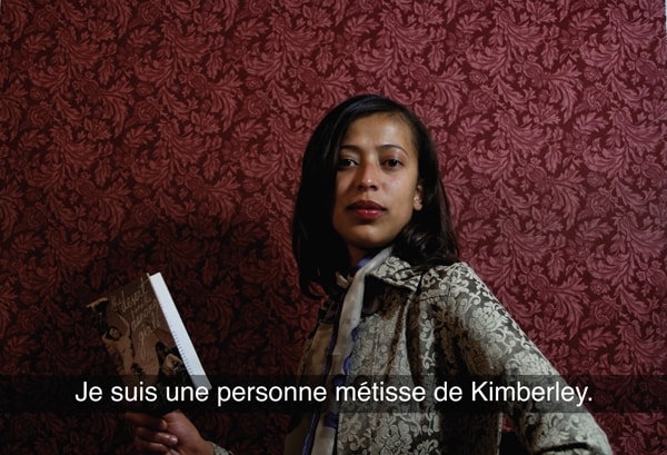
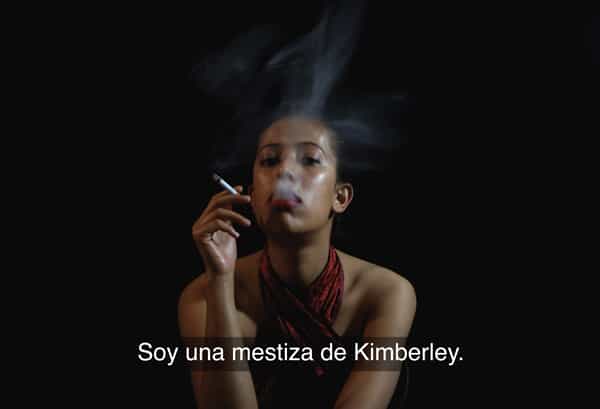
Bouquet is a work about “abuse and innocence, and their relation to one another,” Goliath explains. “When an individual is subjected to abuse they become canonised; they become almost saintly,” she says. Her use of her own body as a subject in this and two other works in the same show, EKKE and Ek is ‘n Kimberly Coloured (both 2007), is as much about the political and historical meanings of the body – and the female, coloured body in particular – as it is about “self-love and self-loathing,” she says. “We all stare at ourselves in the mirror for ages. We do. We’re deeply complexed about all sorts of little things.” Her introspective frankness is balanced by a fascination with South Africa’s bizarre collective consciousness. Her verdict on the state of the nation: “The national psyche is a bit of a mess right now. A collective neurosis has sort of infiltrated our everyday lives… Tea breaks are spent brooding over the national energy crises and corrupt politicians; braais are a forum for polemics.”
For her critical examination of coloured female identity, particularly in Ek is ‘n Kimberly Coloured, a series of striking performance-based photographic portraits, Goliath has been compared to Tracy Rose. But where Rose seems to absorb her performance personas into real life, Goliath is far from the embodiment of some of the aggressive subjects she portrays. At our Rosebank café meeting her languorous conversation drifts between level-headed discussion of her work and tentative selfscrutiny – punctuated now and then by an effete drag from a meticulously rolled, twig-thin cigarette.
Before embarking on a Bachelors degree at Wits University in 2004, Goliath completed a three-year diploma is fashion design. Why the move? “Oh, I can’t answer that question… It seemed a natural progression to make. I was always interested in unwearable fashion.” She cites fashion designer Hussein Chalayan’s “animatronic” sculptural dresses as a major inspiration, however, since practicing fine art she has steered clear of sculpture and now works chiefly in two-dimensional lens-based media. “I started out very traditionally in first year while everyone else was very willing to jump on the video and performance art bandwagon,” she says.
One of the outcomes of her early investment in painting is a series of grizzly “meat paintings”, made using formaldehyde to preserve the raw meat that she smeared or packed onto her canvases. I ask her how she came upon meat as a medium. “I suppose I reached this point in my life where I thought, what the fuck am I supposed to paint now?” she answers. “So many great painters have painted the carcass, and I thought, what about using the thing itself?” Murder on Seventh is the title of Goliath’s current work in progress. This will contribute to her Masters degree at Wits, which she aims to complete in 2009. Drawing from the crime writing of English novelist P.D. James, the installation-based body of work adopts generic detective story motifs to construct scenes reminiscent of those typically created in the board game Cluedo (the butler, in the conservatory, with the candlestick). Locating this work in the context of South African society, Goliath explains that her quotation of the whodunit genre aims to expose a national desire for what James calls the “restoration of order”.
She meanders back to her preoccupation with the national psyche and offers a reading of it in this light: “What is this obsession with societal ills? Is this simply morbid fascination? … I think not, well at least not entirely. Rather it is a need and desire for resolution, closure, answers.”
 clockwise from top left Gabrielle Goliath, Ek is ‘n Kimberly Coloured (left panel), (middle panel), (right panel), 2007, archival print, 78 x 48.5cm;
Gabrielle Goliath, EKKE, (right panel), (middle panel), (left panel), 2007, archival print, 78 x 48.5cm.
Anthea Buys is an independent journalist and art critic for the Mail & Guardian.
About Gabrielle Goliath: Born in Kimberley (1983), Goliath received her diploma in fashion design from Witwatersrand Technikon (now University of Johannesburg) in 2003. Currently working towards the completion of a Masters degree in fine art at Wits University, she holds a double major undergraduate Bachelors degree in English literature and fine art. Winner of the Art’s Alive/JHB City Exhibition, and joint winner of the Martienssen Prize, both in 2007, her work video work, Bouquet II, was shortlisted for the 2008 Sasol New Signatures. She participated in Four Tales, a group show curated by Thembinkosi Goniwe at Gallery Momo, Johannesburg.
ON INTENTION AND METHOD
HASAN AND HUSAIN ESSOP’S CONSTRUCTED PHOTOGRAPHS ADDRESS MORE THAN JUST THE CONTRADICTIONS BETWEEN MODERNITY AND TRADITION, ISLAM AND THE WEST, WRITES SHAMIL JEPPIE.
 top – bottom Hasan and Husain Essop, Thornton Road, Fast Food, Passing By,
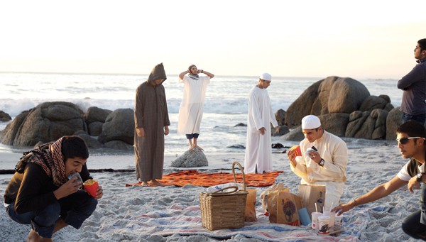
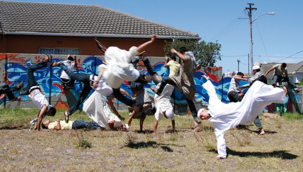
Pit-bull Training, all 2008, all lightjet C-print on Fuji Crystal archive paper, all 70 x 123cm.Hasan and Husain Essop are fraternal twins, a fact that has a distinctive impress on their art. The brothers, who respectively studied photography and printmaking at Cape Town’s Michaelis School of Fine Art, collaborate intimately. Their medium is colour photography – radically recast through computer manipulation. The pair’s collaboration entails their own appearance in all their images, and very often the images are split seamlessly to reflect two sides, or two connected selves. Their images are busy and energetic, and one has to look closely to realise that a pair of twins occupies the space. The stitching together of what are a number of separate shots is achieved seamlessly, their finished work not easily revealing its fabricated nature.
Hasan and Husain Essop’s work appears to be fraternal co-operation without a flaw or fault. Is this how they share and live in reality? Is this the brotherly love of twins, the spontaneous and spirited partnership of twins? Where is the rivalry and competition? These latter questions come close to being addressed in the work Pit-bull fight (2007), which reveals the possibilities of contestation and competition through the aggressive and maligned dog held at bay. The work is autobiographical, yet it is also about a wider phenomenon in parts of the Cape Flats. More broadly, the pair’s photographs are about themselves as twins, while at the same time speaking about aspects of life on the Cape Flats, about contemporary Muslim youth, about the contradictions of identity, about religion and specifically reflections about their own origins and belonging. Through their photographs, the brothers seem to be asking fundamental questions that young men (and women) of their generation, class, and communal or religious formation are constantly pushing and pursuing. Together they could be seen as parts of an unfolding essay in which the Essops explore their own relationships as brothers; as young, brand-conscious, middle-class men on the Cape Flats; as young Muslim men hovering in a liminal space, inside and outside a ‘community’ and world religion that is the object of intense focus in the media and contemporary politics. The brothers bring together a religion of great age and global spread with pop culture in their combination of themes and medium of work (this may appear offensive to some, particularly those who want to tighten the boundaries of religion and community). It would make no great point to say that their work can be read at multiple levels, which, of course, is the case with any reasonably good art. Their materials and the way they tackle the issues are fresh, unique and draw the viewer in to look and look again. Two recent works merit pause: Fast Food (2008), shown at Art Basel earlier this year, and Thornton Road (2008). In the former, pop culture and consumption combine with an act of religious devotion, while the latter work juxtaposes political activism with religiocommunal markers. Cleverly titled, Fast Food presents the brothers on a beach on the Atlantic seaboard; they are shown in various positions of prayer, also breaking the fast during Ramadan with McDonald’s fast food.
In Thornton Road, they are Muslim youth on the Cape Flats wearing long white tunics (variously called thawbs, jubbas or gallabiyas) and framed in postures of rebellion or protest. But the dominant image is a Coca-Cola sign and the consumption of the drink in one part of the image. Rebellion against power while at the same time consumption or subjection to the most famous global brands is a central contradiction of Muslim youth politics, this work seems to be saying. A recurring motif in their work, present also in Thornton Road, is the figure of the grim reaper. This would be easy to miss; this figure could easily be misread as yet another Muslim youth in a long hooded tunic of North African origin. The figure’s origin is uncertain, possibly deriving from contemporary popular culture, particularly the cinema. It would be simplistic to read the work of the Essops as simply addressing contradictions between modernity and tradition, Islam and the west, and other such easy and, these days lazily reiterated, binaries. They are making very important commentaries on, and putting into question youth sub-cultures; they are cutting into obsessions and anxieties about aspects of religious practice, and at the same time they point to a contemporary faith in consumption. Are the possibilities for youth either fervent faith or obsessive consumption? There is far more subtlety at work here, despite the fascinating colour and garrulous movement these works frame, and indeed their generous size.
It will be interesting to see how these visual essays proceed to explore other contradictions and current issues. Can the brothers push the use of the doubling technique further without becoming boringly repetitive or solipsistic? Will they pursue their current themes until they themselves have matured beyond them? Would it at all be possible for them to offer a post-twins perspective on their world? These are questions they will have to resolve, but in the meanwhile their work will have tremendous resonance for many publics globally.
Shamil Jeppie is a senior lecturer in the department of historical studies at the University of Cape Town and a key advisor to the South Africa-Mali Timbuktu Manuscript Project.
About Hasan and Husain Essop: Born in Cape Town (1985), the Essop twins completed their fine art studies at Michaelis School of Fine Art in 2006. They debuted their distinctive, collaborative photographs on The Loaded Lens (2007), a photographic group exhibition at the Goodman Gallery Cape. Invited to participate on the tenth Havana Biennial (March 27 – April 20, 2009), their work has appeared on Spier Contemporary (2007-8), a travelling award exhibition, and at Art Basel, Switzerland (2008).
TIME AND CHANGE
WORKING WITH PAINTING, SEWING AND VARIOUS LENS-BASED MEDIA, RESHMA CHHIBA YIELDS AN AESTHETIC GRAMMAR THAT IS DISTINCTLY HER OWN AND COMFORTABLY INTER-DISCIPLINARY, WRITES ROBYN SASSEN.
 clockwise from top left Reshma Chhiba, Unawakened, Unbridled, Stripped,
Restrained, all 2008, all pigment ink on cotton paper, all 60 x 40cm.
Red and black. Emerging from Reshma Chhiba’s recent solo debut, Kali, held at Johannesburg’s Art Exra in June, these two colours throbbed through the solar plexus, leaving a sense of bruise. Traditional images of the Hindu goddess Kali – also known as the Black goddess – reflect her skin as blue, offering a key into the possibility that the violence in Chhiba’s exhibition may have been metaphorical. Showing intimacies of family culture in art contains knobbly pitfalls that rest somewhere between fact and belief, vulnerable to becoming defiled in the telling. Imbued in Chhiba’s Hindu roots, Kali contained a universalism which drew emotional goosebumps.
Sitting at her desk at the Johannesburg Art Gallery, her day job, Chhiba looks anything but intrepid investigator into the horrors and sexuality of Kali. Her hair, a gentle mass of kiss-curls, doesn’t resonate with the goddess’s unbridledness. Her candour in engaging with the work, however, does. “I’m still waiting for the priest to come with his trident to excommunicate me”, she grins. “My family is not strictly orthodox – if they were, I probably would never have studied art – but the traditions from which they originate are.”
Chhiba dedicated her debut exhibition to her maternal grandmother. “She was a woman of strength, who was married at the age of three. She was illiterate. She came to South Africa in her fifties. She died when I was 14; I was never able to converse with her. She spoke Gurajati. I am supposed to be a Gurajati-speaking girl, but I am not.”
Chhiba speaks of many languages, including the physical. “I am a classical Indian dance teacher and have practiced Bharata Natyam, since I was eight.” An untitled video from 2003 conflates the grammar of Indian classical dance with traditional sign language in accounting for violence on women. There is no sound – it’s about inaccessibility. You have to read their bodies’ grammar.
Chhiba takes me down several paths to Kali: myths and legends reveal her as aggressive terrifying force, but also a symbolic one. “The outstretched tongue is a sign of embarrassment. She stands on Shiva, her consort, in error”, Chhiba explains. “Kali is the goddess of time. The 55 skulls around her neck represent the sacred alphabets of Sanskrit; her many arms are about detachment. Shiva and Kali together represent life. Shiva’s consciousness; Kali’s energy.”
Tongues and hair, lotus flowers and gesture, her exhibition seems to speak of sexuality. “It does,” Chhiba concurs, “but that’s not all.” The four reversed photographic portraits included on the show are a case in point. Reminiscent of the work of Finnish photographer Marjaana Kella, the images offer four life stages of a Hindu woman, using the hair as a signifier, and the codes of interpretation, from virginal child to married woman to widow to Kali herself; the images run rich with interpretative association. In truth the backs of the heads are as revealing as the faces, but quite frightening as they embody an unknown.
Chhiba creates portraits of her mother by twisting saris across painting stretchers. She represents parts of Kali in twodimensional works, blending stitching with kum-kum powder and tumeric, in their spiritual and physical composition. “Kumkum is used ritually. It symbolises feminine energy, menstrual blood. Tumeric is about memory and healing. My grandmother used to make medicine from it. I also use hand-crushed coal and incense ash. The pigments are all earth based. They relate to the mother, the life sustaining force.” Inescapably, her work is physical to make. Sewing into massive canvases, Chhiba is not contributing to the feminine litany: she is performing a dance.
“At some point, what I am doing will be misunderstood. My people were sceptical about my doing this degree, but now, they hide their faces because – touch wood – I have achieved something”
This she certainly has: the thrust of her show, the one that grabs and holds you, is the sophistication of its internal vision. Working with painting, sewing and various lens-based media, Chhiba yields an aesthetic grammar that is distinctly her own and comfortably interdisciplinary.
Robyn Sassen is Arts Editor of the SA Jewish Report.
About Reshma Chhiba: Born in Johannesburg (1983), Chhiba holds a Bachelors degree in Fine Art from Wits University (2003). She has participated on numerous group exhibitions, including Women: Photography and New Media at the Johannesburg Art Gallery (2006) and Impossible Monsters (2007) at Art Extra; she held her debut solo exhibition, titled Kali (2008), at the same venue. Joint winner of the Martiennsen Prize in 2003, she was selected by the Goethe Institute to train and work as an art mediator on Documenta12, in Kassel, Germany. She is currently completing her Masters degree in Fine Art at Wits.
NOSTALGIC TECHNOLOGICAL FUTURES
ROWAN SMITH’S CARVED-WOOD INSTALLATIONS, LIGHTBOXES AND INTERVENTIONS WITH DEFUNCT TECHNOLOGY ESTABLISH A DIALOGUE BETWEEN OBSOLESCENCE AND THE EVER SHIFTING NEW, WRITES NADINE BOTHA.
 clockwise from top left Rowan Smith, Extensions of the Universe (detail), 2007, mixed media,
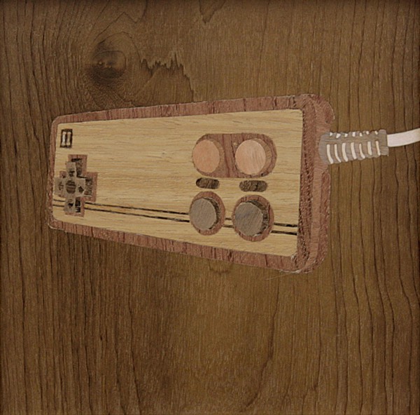
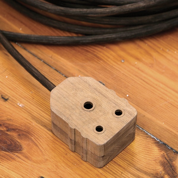
dimensions variable; Rowan Smith, Nintendo Marquetry Joystick 1 (detail), 2007, wood veneer and cane,
dimensions variable. Photos: Paul Grose; Rowan Smith, Kraftwerk is Electric, 2007, acrylic on board, seven
segment display and circuitry, dimensions variable Courtesy Whatiftheworld/Gallery. Photo: Paul Grose.
Rowan Smith’s retro-futurist revivals of obsolescent technology are so hip they look as if they were sourced from Milnerton Market, Cape Town’s bohemian boot sale venue. But Smith’s work is not about nostalgia; his carved-wood installations, lightboxes and interventions with defunct technology deal with the nostalgias that are inherent in our projected futures.
“The present day is characterised by the fast progression of technology,” explains Smith, a somewhat bashful, blueeyed boy who seems to hunch into his keffiyea. “The digital revolution influences every aspect of society. As a reaction to constantly having to update your skills and knowledge regarding technological advances, I became interested in looking at things that were already obsolete, and in so doing became drawn to that very early digital aesthetic – from the 1960s and 70s, at the same time as the space race.” LED-displays, big knobs, wood veneer, Nintendo handsets and dot matrix printers might seem lo-fi but, as Smith explains, lo-fi is relative to now. People back then dreamed of a future in which there would be flying cars and holidays on the moon. Instead we have cellphones, Hummers and the continuing hyperbole of technology that has not satisfied those retro visions of the future. Smith cites art critic Harold Rosenberg’s notion that futures are not so much underas over-determined, and that there are so many defined futures for them to be constantly recycled and reused. As such, our conception of the future hankers back to what we thought would be possible now – it is as though our dissatisfaction with the present and its undelivered promises drives the insatiable thirst for new technology. Smith’s piece Dot Matrix Loop (2007) drew much interest when it was shown at the Johannesburg Art Fair in March. An installation comprising three outdated printers, with the paper feed on a continuous loop, the original chip in each printer has been reprogrammed to spit out one of 50 human characters to the accompaniment of that wailing pig sound of dot-matrix printers. The output on the paper is random and infinite – that is, until the printer jams or switches off. Peripheral devices traditionally require computers to instruct them: Smith’s self-governing printers clearly speak of autonomous technology. “These three printers are exchanging a loop of paper, creating this mini world that is generative and self-populates,” says Smith about what happens to the man-machine relationship when technology starts thinking for itself.
“The subtle relationship between the people of the loop is always random and determined by the printers, so technology is creating this world instead of us creating a world out of technology.” In a hypothetical future, humans may one day become be nostalgic about the power they currently wield over machines; Smith’s work, with its shifting tenses, however, asks whether technology has not already taken charge. With an ever-enlarging landfill of obsolescent technology, are humans really desiring of smile-detecting digital cameras, or is technology driving the constant rejuvenation of what is new? This dialogue between obsolescence and the ever shifting new recalls Theodore Adorno’s doubts about modern art and how “the new” participated as a mechanism in the generation of mass culture. “The new is the longing for the new, not the new itself: that is what everything new suffers from,” he wrote, wary that modern artists were devaluing the art object through constantly erasing the present in their pursuit of the novel. Smith’s nostalgic technological futures raise an unexpected comparison to the constant evolution of the notion of the artist and the artistic space.
“I am fascinated by the idea of the artist in the traditional sense and how much weight that has in society, what the everyday person’s conception of an artist is and how that relates to what an artist might really be today,” he says. “It’s a fascinating thing to be an artist; it’s so bizarre in terms of the trajectory of the artistic profession.” A comment befitting of his alma mater, Michaelis School of Fine Art, Smith brings the corporeal back into the debate through his incorporation of traditional sculpture, woodcarving, casting, etching and painting. Still, his work in the plastic arts is not about reviving a spiritual, cathartic or emotional connection, but again about the associated nostalgia.
“I enjoy the fact that that perception is there for a lot of people – that people think it is now imbued with meaning because my hands made it. Personally, I don’t invest in the notion though. While I can respect skill, in terms of it giving more or less meaning to an art work, it doesn’t make a difference.”
Nadine Botha is a Cape Town-based writer and editor of Design Indaba magazine.
About Rowan Smith: Born in Cape Town (1983), Smith is a graduate of Cape Town’s Michaelis School of Fine Art, where he received the Michaelis Prize for top graduating student in 2007. He has participated on numerous group exhibitions, including Not Yet Famous: Nobody Likes Nothing (2006) at Whatiftheworld Gallery and Picnic (2003) at BellRoberts Gallery (under the collaborative pseudonym “Clive Murdock”). He presented his debut solo exhibition at Cape Town’s Whatiftheworld Gallery in August 2008. His work is represented in the Hollard Collection, Johannesburg.